Stanford CS229 – Machine Learning project.
Algorithms used: Multivariate Linear Regression (MLR), Support Vector Machine (SVM), Tree Method and Random Forest, Neural Network.
Poster:
Paper:
Stanford CS229 – Machine Learning project.
Algorithms used: Multivariate Linear Regression (MLR), Support Vector Machine (SVM), Tree Method and Random Forest, Neural Network.
Poster:
Paper:
In order to prepare for a project, I’ve been looking into benchmarking tips online recently. I found many interesting articles, some of what they suggested had been practiced by me in two jobs: 1) IT consultant for an Engineering company in San Jose, USA; 2) KPI researcher for an Engineering Consulting company in Shanghai; some of them are new and inspiring. I’m sharing to benefit more colleagues.
1. What I’ve done in the past and turned out to be beneficial:
2. What I failed to do:
3. What are inspiring, and I’ll do them in future:
Source of reference: http://www.thecqi.org/Knowledge-Hub/Quality-express/archives/Quality-updates/benchmarking-tips/
Recently did many exercises with Python. I have to say it’s really a beautiful language! Lots of cool stuff could be achieved with a single-line function.
Here are some examples. I will add more when I come across them. Please add comments if you think there’s even a better way!
1. Write a function that takes a list, and returns a dictionary with keys the elements of the list and as value the number of occurances of that element in the list:
def count_list(l): return { key: l.count(key) for key in l }
2. Reverse look-up: Write a function that takes a dictionary and a value, and returns the key associated with this value.
def reverse_map(dict, v): return {value: key for key, value in dict.items()}[v]
3. Print the numbers 1 to 100 that are divisible by 5 but not by 3:
Method 1:
x1=range(101)
print filter(lambda x1: x1 % 5 == 0 and x1 % 3 != 0, x1)
Method 2:
[i for i in range(101) if i%5==0 and i%3!=0]
4. Loop over elements and indexes of a list, print them in a given form:
myList=[1, 2, 4]
for index, elem in enumerate(myList): print ‘{0} ) {1}’.format(index, elem)
result:
0) 1
1) 2
2) 4
5. Nearest neighbor – Write a function that takes a value z and an array A and finds the element in A that is closest to z. The function should return the closest value, not index
def find_nearest(a, a0):
return a.flat[np.abs(a – a0).argmin()]
**More to come!
Stanford CIFE 2014 Funding Candidate Proposal
Energy costs represent about 20% of total operating expenditures for office buildings.
Our case studies of more than fifty buildings have demonstrated that savings of up to 54% are achievable with very little capital investment and little to no distraction for building occupants. As with any mechanical system, building systems performance decline with time and require regular maintenance to work as expected. However, there is no established literature on optimal maintenance strategy based on real performance data from real world projects. Using performance and asset data from our industry partners, we propose to examine the impacts of building systems maintenance on building performance. Additionally, we will identify processes by which the design and construction phases of the project can contribute to implementing optimal facility maintenance strategies.
As a goal of the study, we will compile a set of best practices for asset management and building systems management to maximize occupant comfort and energy efficiency while minimizing costs of operating the system.
I. Neo4j
Neo4j is an open-source graph database implemented in Java, its data are stored in graphs rather than in tables. This way it allows more efficient visualization and analysis for graph-based relationships. Neo4j was first created in Sweden in 2007, and now widely used for many customer-based websites (see http://neo4j.com/customers/ for a list).

(picture from: http://www.slideshare.net/emileifrem/an-intro-to-neo4j-and-some-use-cases-jfokus-2011)
Graph chart is useful for many cases:
(picture from Neo4j 8/14/2014 webinar)
See more use cases, please visit http://neo4j.com/use-cases/
Advantages of Neo4j:
We can see that in traditional SQL DB environment the above queries could take a lot of code and a lot of memory to calculate. But in Neo4j and Cypher Language, minimum code and optimized performance could be achieved.
If you know a little bit of computer systems, you’ll also understand that Neo4j is a system-friendly and optimized product.
In Neo4j, nodes and relationships are stored in separate files. Each node is stored as constant length record with pointer to first property and first relationship. Each relationship is stored as constant length record with pointer to previous and next relationship. This constant length record allows fast look-up. (from Stanford CS145 summer class)
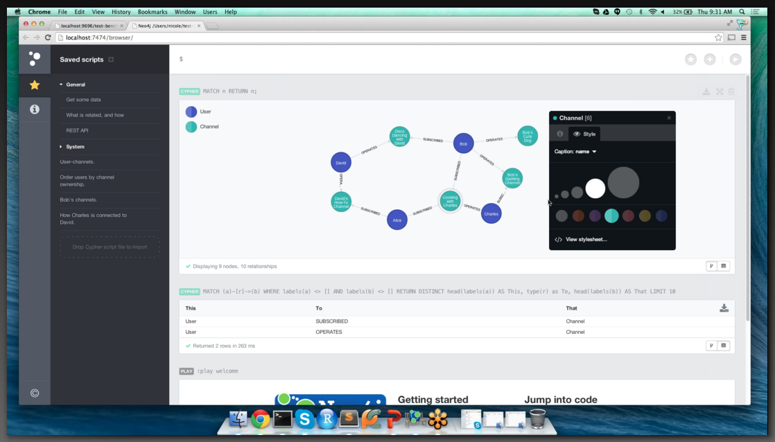 <– Neo4j server web interface
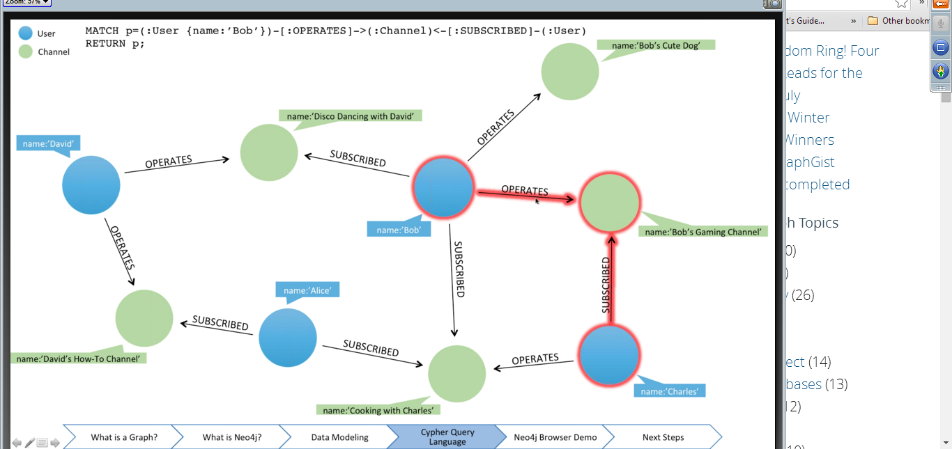
II. Cypher
So what is Cypher?
Cypher is a declarative graph query language for Neo4j. It’s a SQL-like language, but allows for more expressive and efficient querying and updating of the graph store.
The syntax is very intuitive:
 MATCH (Person { name:'Charlie Sheen' })-[:ACTED_IN]-(movie:Movie)
   RETURN movie
In the above we find all the movies acted by actors (Person) with the name “Charlie Sheen”.
Below example enables us to find all nodes which have no more than three layers of relationships between them:
MATCH p = shortestPath (( a ) -[*..3] -( b ) )
where a <> b
RETURN a . name , b . name , length ( p )
Does this remind you of LinkedIn?
See more powerful functions of Cypher, refer to the reference card. bit.ly/cypher-refcard
There’re also advanced track where people do more powerful and creative stuff. Below is in a Graph Database meetup in Chicage where the presenter showed how to hook up to one of the social networks (facebook, twitter, linkedin) and import profiles and relationships in to your graph.

Looking forward to more exciting development in graph database.
Rcharts is a wonderful tool for data analysis and visualization. A month ago I tried all the examples in Rcharts gallery. Here is an example I built:
Adult obesity rate map with hover showing state names.

I can change the color scale, data input, and link data from SQL server to R using .csv files. Check out more example on the gallery website: http://rcharts.io/gallery/
Last week in my Data Science internship, I created some visualizations with D3. I used two github open source libraries “Circular Heat Chart” and “stackpercent”. This is a wonderful material for presenting multi-dimensional data!

In the chart above, the chart is representing 3 time blocks in a day:
Midnight – 4am, 4am – 8am, 8am-noon
The labels are very easy to update, so there’s tons of flexibility to use this to monitor data of any time periods. And different colors represent different status, you can define whatever you like.
Below are two sample charts I made:

Documentation:

Documentation:
These three weeks I built a web application using Python (web.py and jinja2), and SQLite. It’s a website where you can add bids to open items, browse items of interest, and search item details (started date, ends date, current price, who sells it, how many bids, and descriptions, etc.)

There’re three milestones for this project:
1. Database preparation
2. Setting integrity constraints
3. Web application and interface
Below are some screenshots to show the project progress:
–Before organizing the data, a mess for human eyes–

–Many files and codes got created and operated on the data–


–Magic happens after all the programing tools–


I love Computer Science!

Includes:
1) Key findings of important factors by year;
2) stack columns graph showing the cumulative growing trend;
3) pie chart showing contribution by different sectors;
4) level of different state (although not geographical, it serves a much better tool to compare);
5) despite the cumulative amount, the bar chart of units number in each year (amount of LEED projects in each year, to serve as a reference for the corresponding year’s total saving amount level);
6) stack column showing two different contributors’ yearly contribution.
This is a summary of the whole model document, with succinct information presented with graphs. Users can check details from previous tabs, which I will cover in my future Excel series.
I built an Excel model for USGBC in 2013 for calculating water savings by LEED buildings. The model was totally build from scratch, based on 17,000 data entries of LEED certified buildings. All the calculations and visualizations were done using Excel functions and graph tools.

It has information about
– each year’s saving contribution to the current
– each year’s accumulative level
– total savings
– validation (adding total from two different directions and check if the results are the same)

interactive graph
User can choose growth rate to see auto-updated cumulative water saving calculation model. Growth rate is defined as new LEED buildings of the year compared to new LEED buildings of the previous year.
Here I chose 20% growth rate for 2014, and 30% rate for 2015. A sharp increase in 2015 could be observed in the graph. It’s due to the growing amount of 2015 projects, while the contribution from projects of previous year remain at the same level (with degradation, ~1%).

2020 graph using the same method, where the growth rates are all set to be 5% from 2014 to 2020.
