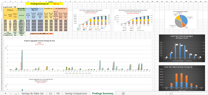
Image

Excel data model & visualization – 02. Yearly Trend Reporting Dashboard

Excel data model & visualization – 02. Yearly Trend Reporting Dashboard

Includes:
1) Key findings of important factors by year;
2) stack columns graph showing the cumulative growing trend;
3) pie chart showing contribution by different sectors;
4) level of different state (although not geographical, it serves a much better tool to compare);
5) despite the cumulative amount, the bar chart of units number in each year (amount of LEED projects in each year, to serve as a reference for the corresponding year’s total saving amount level);
6) stack column showing two different contributors’ yearly contribution.

This is a summary of the whole model document, with succinct information presented with graphs. Users can check details from previous tabs, which I will cover in my future Excel series.

Image

Excel data model & visualization – 01. Sum Table and Interactive Growth Trend

I built an Excel model for USGBC in 2013 for calculating water savings by LEED buildings. The model was totally build from scratch, based on 17,000 data entries of LEED certified buildings. All the calculations and visualizations were done using Excel functions and graph tools.

data visualization work example

It has information about
– each year’s saving contribution to the current
– each year’s accumulative level
– total savings
– validation (adding total from two different directions and check if the results are the same)

interactive graph

interactive graph

User can choose growth rate to see auto-updated cumulative water saving calculation model. Growth rate is defined as new LEED buildings of the year compared to new LEED buildings of the previous year.

Here I chose 20% growth rate for 2014, and 30% rate for 2015. A sharp increase in 2015 could be observed in the graph. It’s due to the growing amount of 2015 projects, while the contribution from projects of previous year remain at the same level (with degradation, ~1%).

water model 3

2020 graph using the same method, where the growth rates are all set to be 5% from 2014 to 2020.

Starting to Use Shiny Markup

Today I started my blog – Data Mining, Business Intelligence. I want to use this blog to showcase my work related to Data Science.

Below is the first example, where I follow JHU’s online course “Developing Data Products” (on Coursera) and made this Demo.

It’s written with “Shiny” package, which is very powerful to produce interactive web applications using R. It’s built under R version 3.0.3, so I didn’t even have to install it.

Illustrating Markup

We can use this page to input values, exhibiting outputs, and embed functions and print outputs. It’s simple and well structured.

Next step is to put all my previous R works (~13 projects) in a clean, organized, and interactive format and present in my blog. Long term goal is to create a website to showcase these projects, and end goal is to build a website with good UI and meaningful purpose to help people.